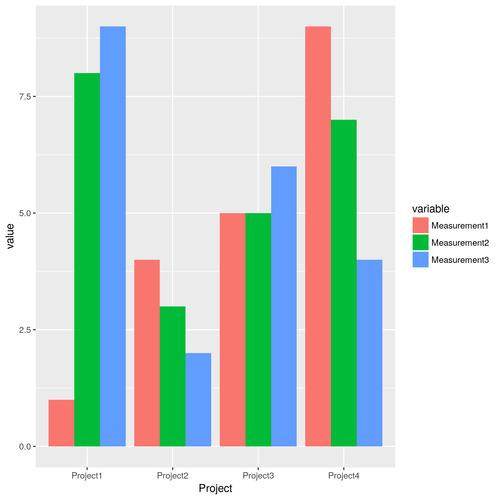
For the professional web developer/engineer who gets paid to write code and build websites, writing R code for data science should feel somewhat familiar. Web development and data science can both involve writing code. However, some of the fundamental concepts are quite distinct, such as data structures. For instance, at multiple points in my life, after months of writing code almost exclusively for web development, I will suddenly get the idea that I want to analyze some data. In my head, I will imagine a bar chart that looks like this:
To make my chart, I imagine a nice clean HTML table that (simplified) looks like this:
| Project | Measurement1 | Measurement2 | Measurement2 |
|---|---|---|---|
| Project1 | 1 | 8 | 9 |
| Project2 | 4 | 3 | 2 |
| Project3 | 5 | 5 | 6 |
| Project4 | 9 | 7 | 4 |
So I fire up R and get to work transforming my raw data into something I think will get me to my goal. My basic process might look something like this:
> Project <- c("Project1","Project2","Project3","Project4")
> Measurement1 <- c(1,4,5,9)
> Measurement2 <- c(8,3,5,7)
> Measurement3 <- c(9,2,6,4)
> ProjectData <- data.frame(Project, Measurement1, Measurement2, Measurement3)
Then I crack open one of my many R books or consult one of countless online tutorials and I encounter examples like this:
# Grouped Bar Plot
counts <- table(mtcars$vs, mtcars$gear)
barplot(counts, main="Car Distribution by Gears and VS",
  xlab="Number of Gears", col=c("darkblue","red"),
  legend = rownames(counts), beside=TRUE)
But because of the way I have shaped my data structure, I fail many, many times trying to do variations on combining geom_bar():
ggplot(data = ProjectData) +
  geom_bar(mapping = aes(x = Project1, y = Measurement1), stat = "identity", position = "dodge") +
  geom_bar(mapping = aes(x = Project2, y = Measurement2), stat = "identity", position = "dodge") +
  geom_bar(mapping = aes(x = Project3, y = Measurement3), stat = "identity", position = "dodge")
Or hoping I can get it to work with fill:
ggplot(ProjectData, aes(x=Project, y=Measurement1, fill=Measurement2)) +
  geom_bar(stat="identity")
Or maybe facet_wrap():
ggplot(data=ProjectData, aes(x=Project, y=Measurement1)) +
  geom_bar(stat="identity") +
  facet_wrap(~Measurement1)
None of this works. All of the examples I've consulted have two data points, but I want three bars. I end up with a search history that looks something like this:
ggplot fill multiple
ggplot multiple bars
ggplot fill multiple geom_bar
ggplot compare 3 values
ggplot2 facet_wrap()
ggplot2 three values x bar
But then, at some point in this process I eventually realize that I have made a fundamental error and realize that my data is not organized properly. I remember that I need to "reshape" my data in R, to convert the data from wide to long format:
> library(reshape2)
> ProjectDataLong <- melt(ProjectData, id=c("Project"))
The code above makes the data look rather odd to my eyes. Rather than appear once, some values now appear multiple times:
| Project | variable | value |
|---|---|---|
| Project1 | Measurement1 | 1 |
| Project2 | Measurement1 | 4 |
| Project3 | Measurement1 | 5 |
| Project4 | Measurement1 | 9 |
| Project1 | Measurement2 | 8 |
| Project2 | Measurement2 | 3 |
| Project3 | Measurement2 | 5 |
| Project4 | Measurement2 | 7 |
| Project1 | Measurement3 | 9 |
| Project2 | Measurement3 | 2 |
| Project3 | Measurement3 | 6 |
| Project4 | Measurement3 | 4 |
However, the new data structure allows me to use ggplot2 more like it was intended:
ggplot(data = ProjectDataLong) +
  geom_bar(mapping = aes(x = Project, y = value, fill = variable), stat = "identity", position = "dodge")
This produces the chart I imagined:
And at last I can get to the process of exploratory data analysis. So I hope that by writing this blog post my future self will be less likely to forget this basic concept of data science.
Comments